SUNNY SIDE UP produces everything from brand tagline to design, content, and uniforms! Presenting “THE BUSKER” booth to jazz up SUMMER SONIC!
Hello, SUNNY DAYS readers! I’m Niimura from Public Relations Division 1. Today, I’m excited to share one of SUNNY SIDE UP (SSU)’s unique event production examples that goes beyond PR.
On August 17 and 18, SUMMER SONIC 2024 , one of the largest urban music festivals in Japan,was held in Kaihin Makuhari, Chiba, and at Expo Commemorative Park in Osaka.
At SUMMER SONIC, it’s not only about enjoying performances from various domestic and international artists—guests also get to savor drinks and food from the many booths set up on-site.
Among these booths, SSU fully produced a special booth for “THE BUSKER” Irish whiskey, creating a unique spot for festival-goers to enjoy their drinks while soaking in the music.
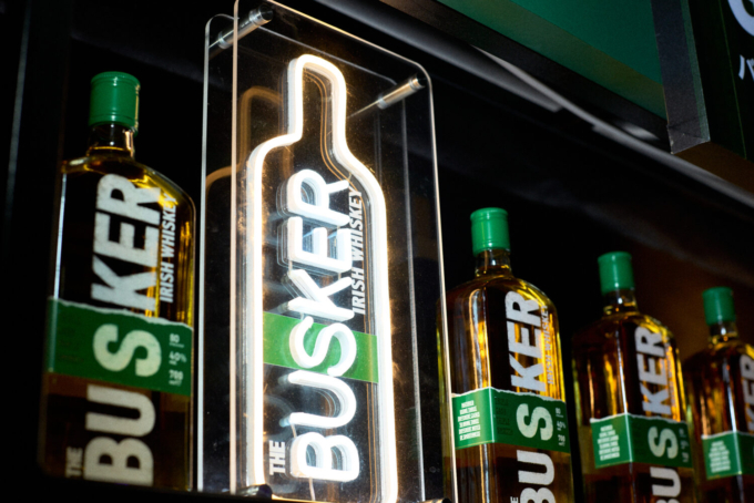
The Irish whiskey brand “THE BUSKER” offers a unique tropical fruit-flavored whiskey that captures the essence of Ireland.
Though it’s a relatively new brand, launched in 2020, it achieved top sales in the Irish whiskey category in Japan by 2023 and earned both Gold and Silver at the “World Whiskies Awards 2024,” establishing itself as one of the most talked-about whiskey brands today.
Named after the English term for “street musician,” THE BUSKER embraces a brand concept that aligns closely with music. Since last year, it has partnered with SUMMER SONIC, presenting a “Busker × Music” theme that brings fans engaging, music-centered experiences.
Now in its second year at the festival, THE BUSKER has made “music affinity” a centerpiece of its booth design. I went to check out the site myself to see the stylish and bold presence of the BUSKER
Stylish and Standout “THE BUSKER Booth”
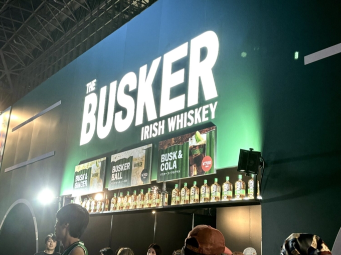
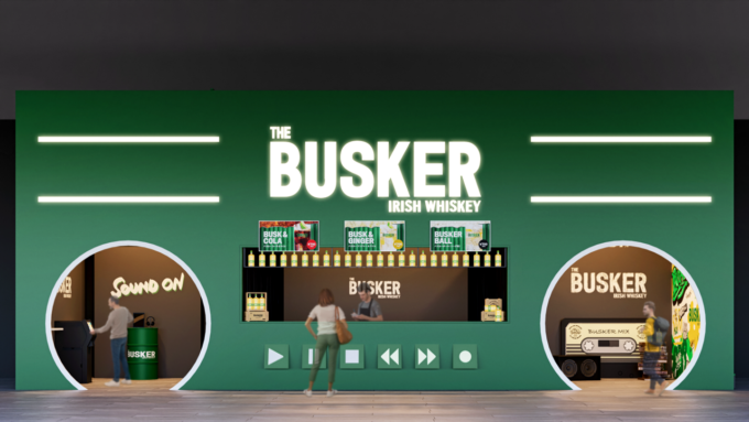
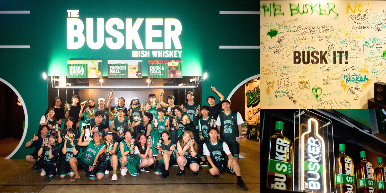
The booth, designed in THE BUSKER’s signature green, features large, illuminated letters spelling out “THE BUSKER IRISH WHISKEY.” This striking setup makes it visible from across the event space, creating an unmistakable and stylish presence.
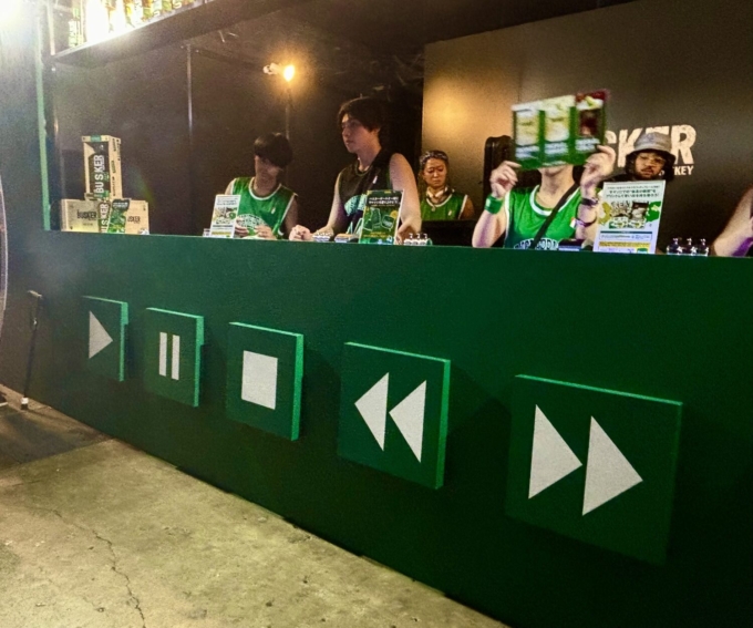
If you look below the counter, a nostalgic play and pause buttons…
As I step back to get a full view…wow!
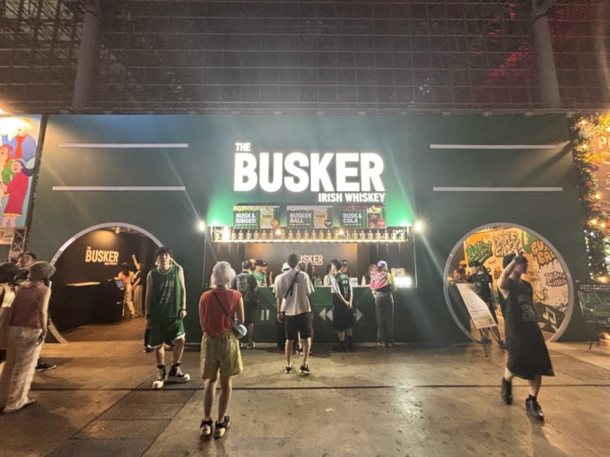
The booth was designed to look like a giant “boombox”! Attendees in line could be heard saying, “So cool!” “Stylish!” and “It’s so nostalgic!”
Next to the counter, there was a “Legal Wall” decorated with street-style wall art, where visitors could freely express their love for SUMMER SONIC and THE BUSKER.
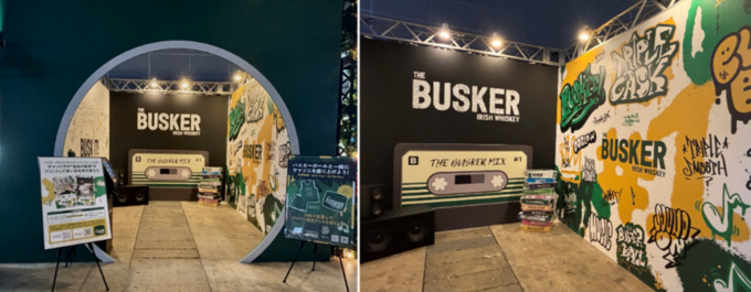

The Legal Wall, filled with personal messages from visitors, quickly became a must-visit photo spot!
There were also headphones placed on green, BUSKER-branded drum barrels. Thanks to the collaboration with producer and trackmaker STUTS, who also performed at this year’s SUMMER SONIC, attendees could enjoy a playlist specially made for this event.
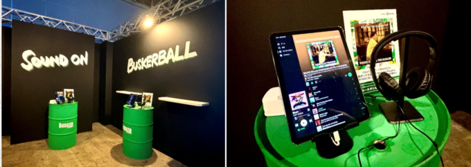
Secret hidden with the message on the wall!
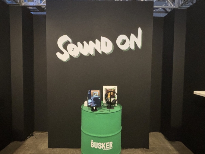
The brand tagline “SOUND ON,” prominently displayed on the booth, represents BUSKER’s vision to “create moments that connect people, bringing the joy of music and smiles to any scene”, much like a street musician.
The logo design itself, in fact, was hand-drawn by SSU members to amplify that authentic street vibe!
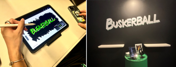
Asking the Member: The Concept Behind the Booth
This time I had the chance to ask SSU’s Yusuke Koto, the designer and content planner for this BUSKER booth, about his key design choices and the creative intentions behind the booth.
Koto Yusuke(Public Relations Division 1, Group 2, Leader)
Last year was BUSKER’s first time at SUMMER SONIC, and SSU handled that debut as well. With last year’s experience, we re-evaluated certain aspects of the operation, focusing on ways to make BUSKER’s appeal come across more effectively.
When designing this year’s booth, I realized that simply presenting reference images might not capture BUSKER’s unique world and appeal. So, from the early planning stages, we created a 3D rendering to present our booth idea clearly.
Inspired by a playful “boombox” concept, we went with a bold design that evokes fun and creativity. This design reflects that BUSKER is here to create a space for people who love music, aligning perfectly with its spirit.
Proposed Perspective
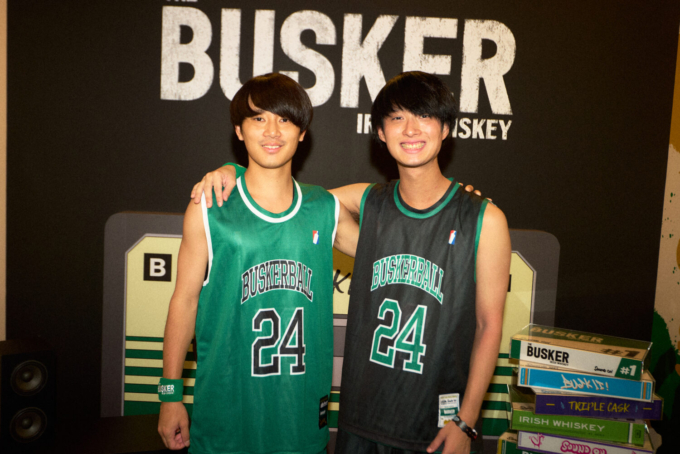
To further promote BUSKER’s highball, dubbed the “Busker Ball,” we designed the staff uniforms with a basketball-inspired look. Initially, the similarity between “Busker Ball” and “basketball” was just a fun idea, but when staff explained the connection to the visitors, they responded, “So that’s why it looks like a basketball uniform! That makes it easy to remember!”
By aligning everything from booth design and content to uniforms, we were able to fully express BUSKER’s brand concept and create a memorable experience for attendees!
In this article, we introduced SSU’s event production work. When people think of SSU, PR often comes to mind, but we hope this piece shows that we’re also engaged in event production!
At SSU, we handle PR and communication strategies for a variety of products and services. Wondering how our communication expertise can make your ideas possible? We’re happy to help, even if it’s just a casual consultation. Feel free to reach out by clicking the “CONTACT” button below.
Thank you for reading to the end!


